I had a request from Nick to take a look at his website as he feels the green page background is a bit ‘dull’ and taking a look around the site there is a bright, fresh feel about the other images. There’s still a good case for keeping the green as this colour accurately reflects the environment -friendly credentials of Nick’s business, the paints he uses are non toxic and natural. The Purepaint logo colours are from the autumnal palette which express the qualities of ‘integrity’ and ‘passion’ that Nick wishes to convey about Purepaint.
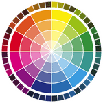
So – how to brighten it up? I’ve suggested that Nick look at some more yellow versions of green but of course keeping them within the same colour family, perhaps something like Pantone 367, 368, 376. There is a similar green in the Purepaint logo.
The addition of a yellow element adds some optimism and confidence to the green nicely reflecting Nick’s personality and values I think!
Have a look at our colour and communication design page to see how colour can affect the way you communicate.
